


Home-Maxxing – The Performance of Everyday Living
Our demands of spaces are changing. Today, they are expected to deliver far more than ever before: they should inspire, promote well-being and, at the same time, meet the highest functional standards. Whether at home, in hotels, in the workplace or in healthcare – interior design today navigates the tension between performance and human needs.
Heimtextil Trends 27/28 address this shift. The Trend Space in Hall 4.2 highlights how societal changes are influencing colours, materials and design – and what new impetus this is generating for the international textile and interior design sectors.
Trend video
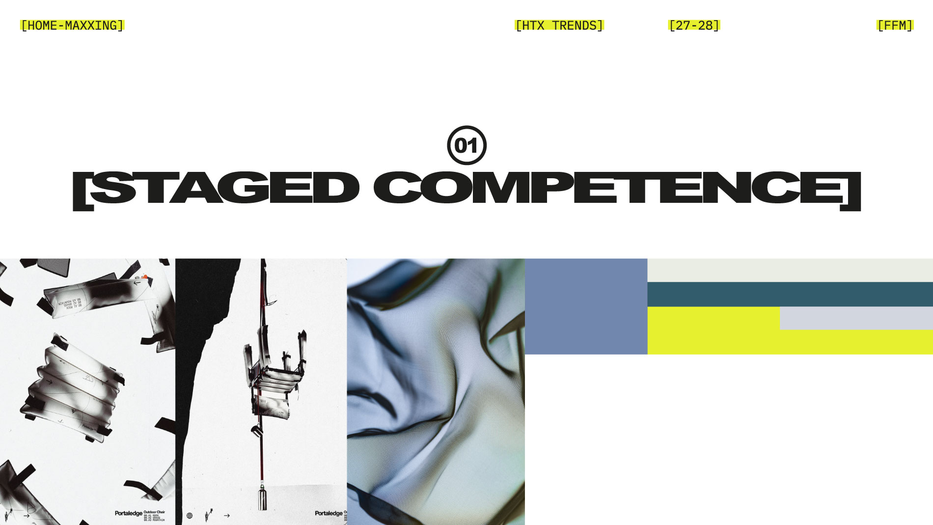
Trend I: Staged Competence
Functionality is meant to be seen. Staged Competence describes an aesthetic in which technical expertise does not remain in the background but is deliberately staged. Textiles and surfaces show what they can do – and, increasingly, how they do it. Technical codes, numbers, symbols and micrographics become design elements. What matters is not only the actual function of a material. Its performance should also be apparent from the outside. Anything that has been tested, engineered and optimised is allowed to look the part. Durability, technical sophistication and verifiable quality become part of the aesthetic.
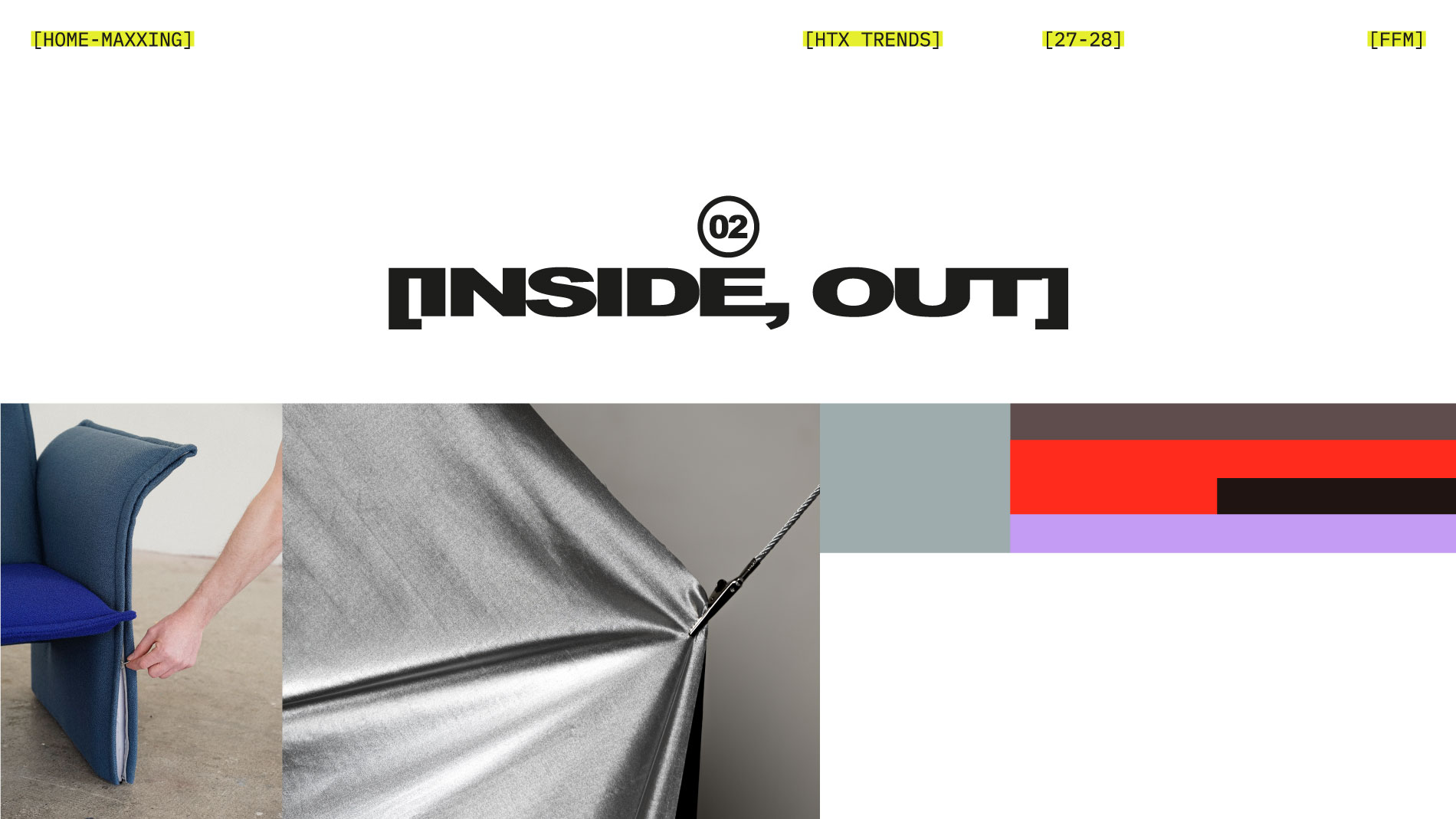
Trend II: Inside, Out
What lies within the things that surround us? Inside, Out responds to a world in which technologies and digital systems are becoming increasingly complex and difficult to understand. The trend counters this opacity with a new openness: structures become legible and connections visible. Screws, straps, seams, cables, zips and other fastenings are no longer concealed, but deliberately become part of the design. A cover may reveal that it can be removed and replaced. Technology does not have to disappear behind a flawless surface.
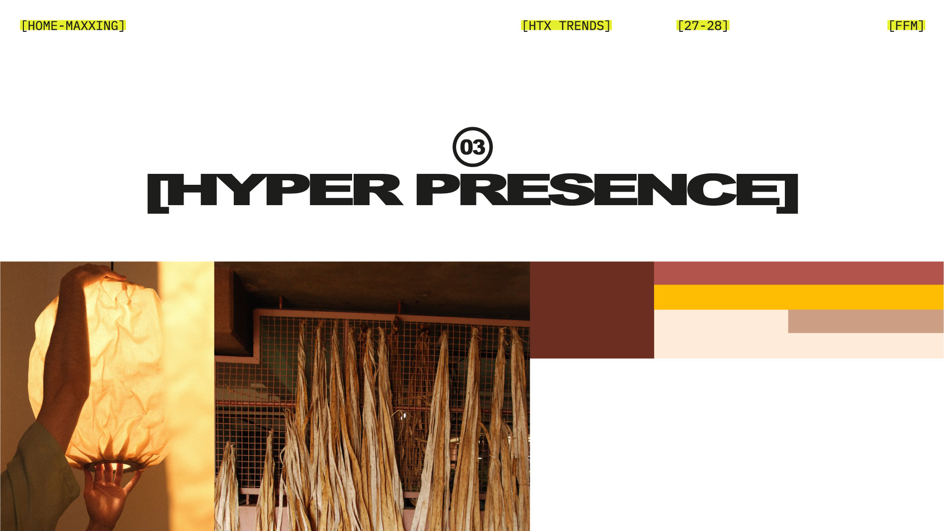
Trend III: Hyper Presence
After all this optimisation comes the counter-movement. Hyper Presence turns attention to what cannot be measured: how a fabric feels against the skin, how a material ages or the atmosphere created by texture. Beeswax-treated fabrics demonstrate how powerfully materials can engage the senses: when warmed, they release the natural scent of honey and propolis. The trend responds to constant digital overstimulation with a deliberate physical presence. Materials accordingly take centre stage: natural fibres, rough, richly textured surfaces, wool, leather and wood-based textiles engage the body and the senses. Creases, patina and signs of wear are not flaws, but part of their character.
Heimtextil Trends 27/28 Colour Palette
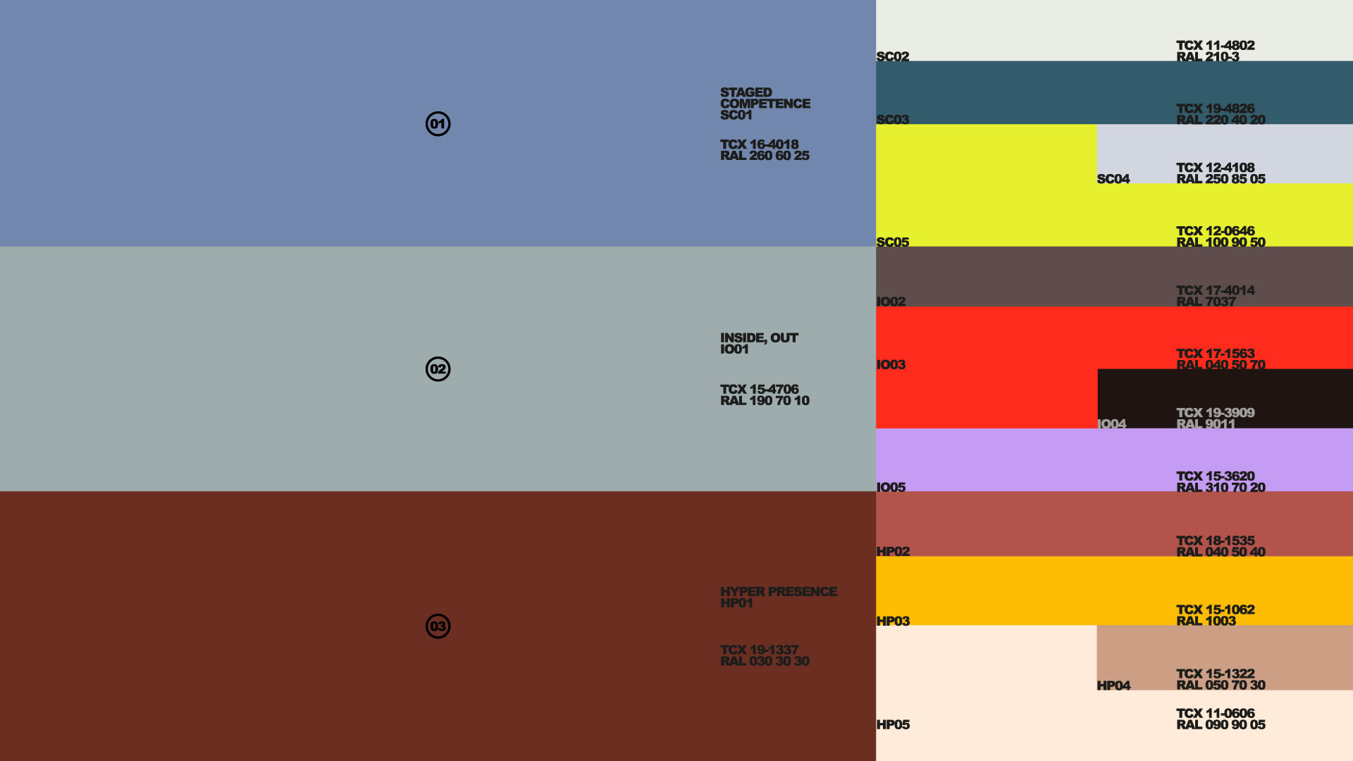
The colour palette translates the three trends into distinct colour schemes: 01 Staged Competence features cool blues, greens and mineral tones that convey technical precision and functionality, accented by a vibrant acid yellow. 02 Inside, Out combines dark graphite and anthracite tones with bold red and soft violet to create striking, almost artificial-looking contrasts. 03 Hyper Presence brings a warm, earthy quality to the palette with rust red, orange, ochre and creamy white, thereby forming a deliberate counterpoint to the cooler, more technical colour schemes.
- Credits (pdf, 35 KB)
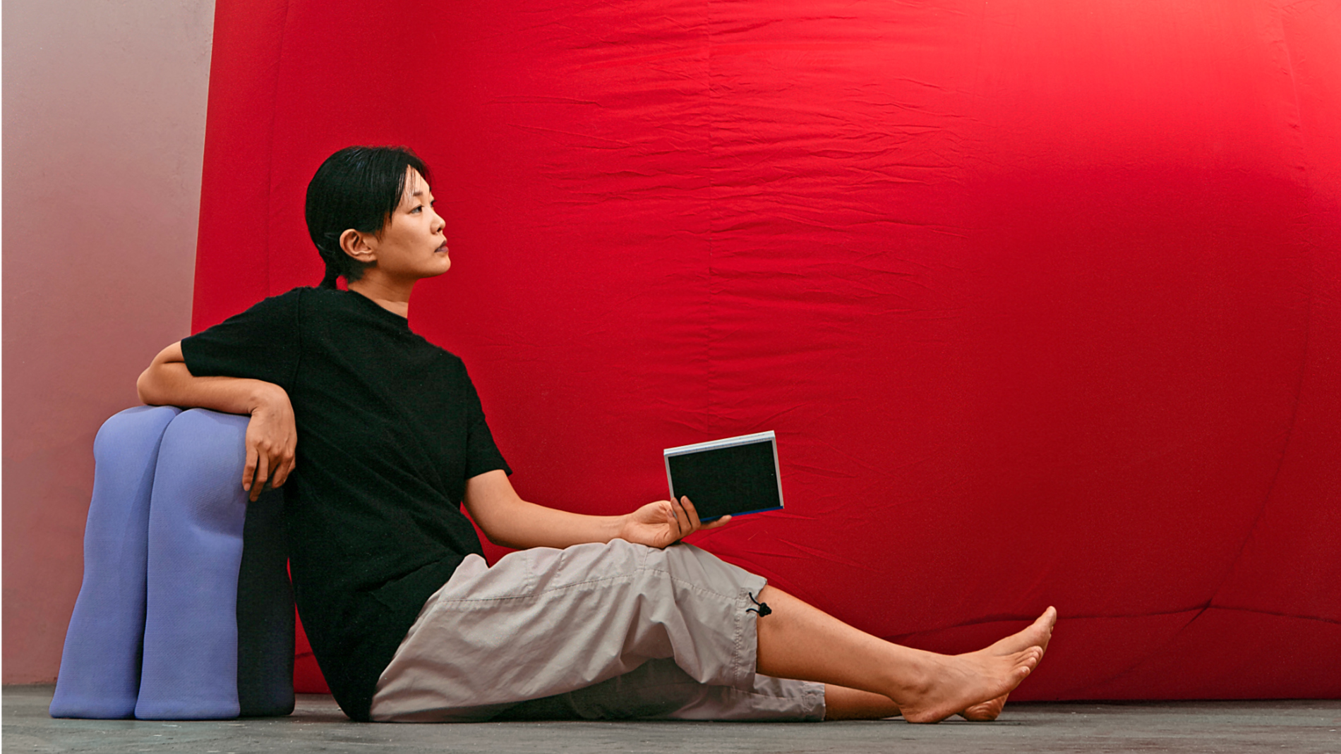
About Alcova Milano
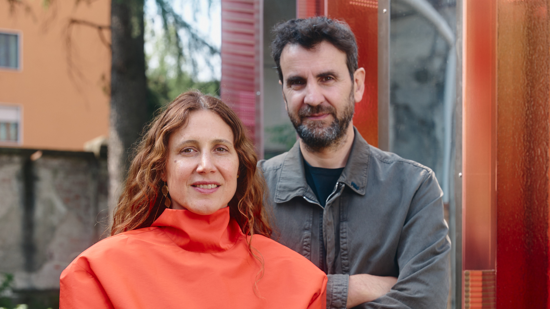
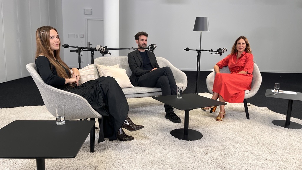
Alcova is an itinerant platform for experimental design, presenting the work of emerging and established designers during Milan Design Week. Founded in 2018 by Valentina Ciuffi (Studio Vedèt) and Joseph Grima (Space Caviar), it is known for occupying disused historical buildings — a former bakery, a cashmere factory, a modernist villa, a military hospital, just to name a few — and opening them to the public for the duration of each edition.
Each site hosts exhibitions and installations that bring together designers, curators, and cultural producers working at the edges of design practice.
Since 2018, Alcova has held three editions in Miami. In February 2027, it opens its first Latin American edition, in Mexico City.
Disclaimer
Some of the colours in this publication may deviate due to print techniques and are to be corrected according to PANTONE® Textile Colour System. PANTONE and PANTONE Textile Colour System are trademarks of ©Pantone LLC, 1995-2024.
Representation of the RAL colours with approval by RAL gGmbH, Bonn. The brand RAL is a registered trademark. Only the individual cards of the RAL 840-HR and RAL 841-GL registers for RAL CLASSIC, the primary standards RAL E1 for RAL EFFECT and the colorimetrically measured RAL DESIGN SYSTEM plus colour sheets are to be used for the binding production and control of RAL colours.
NCS – Natural Colour System© is the copyright and trademark property of NCS Colour AB, Stockholm. Nearest NCS sample is based on visual assessment in accordance with SS 01 91 04 and may deviate from the NCS Notation due to these conditions. We refer to the Original NCS Colour Samples.